So now that we’ve collected data from the web and wrangled it into something useful, what can we say about how accurate Next Bus is?
This post is about the “making of the analysis” … which might be rather boring to those non data geeks (normal people). If you’re just interested in the story and the pictures, jump straight here!
I worked in R, as I usually do for most things statistical and graphical.
Our cleaned up data looks like this:
time                Minutes      VehicleID DirectionText              RouteID   TripID    hour  ID                   departure  arrival   est        err
2014-08-12 10:56:04      98      6470      South to Federal Triangle  64        6464164   10    6464164_6470         1          0         100.90513  2.905133
2014-08-12 10:56:14      98      6470      South to Federal Triangle  64        6464164   10    6464164_6470         0          0         100.73572  2.735717
2014-08-12 10:56:24      98      6470      South to Federal Triangle  64        6464164   10    6464164_6470         0          0         100.56467  2.564667
2014-08-12 10:56:35      98      6470      South to Federal Triangle  64        6464164   10    6464164_6470         0          0         100.39257  2.392567
2014-08-12 10:56:45      98      6470      South to Federal Triangle  64        6464164   10    6464164_6470         0          0         100.22040  2.220400
2014-08-12 10:56:55      98      6470      South to Federal Triangle  64        6464164   10    6464164_6470         0          0         100.04953  2.049533
2014-08-12 10:57:05      97      6470      South to Federal Triangle  64        6464164   10    6464164_6470         0          0          99.87928  2.879283
2014-08-12 10:57:16      97      6470      South to Federal Triangle  64        6464164   10    6464164_6470         0          0          99.70852  2.708517
2014-08-12 10:57:26      97      6470      South to Federal Triangle  64        6464164   10    6464164_6470         0          0          99.53807  2.538067
2014-08-12 10:57:36      97      6470      South to Federal Triangle  64        6464164   10    6464164_6470         0          0          99.36845  2.368450
est is the actual time until arrival from the time of prediction.
err is the prediction error in minutes (postive values are late buses, negative values are early buses).
Minutes is the prediction made at time.
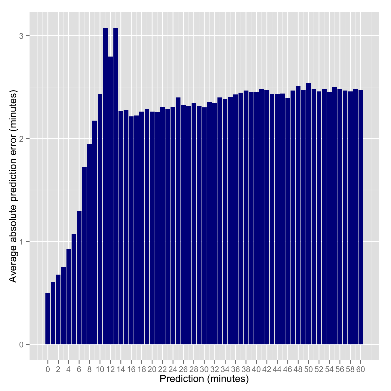
Next Bus predictions are discrete, that is they are made in whole numbers such as 1, 2, 3 … up to 99 minutes — no decimals or seconds. Each prediction (5 minutes, 10 minutes, etc) is made many times. So we can calculate some statistics around each prediction. First I simply calculated the average prediction error.
mape <- aggregate(err~Minutes, df, function(x) mean(abs(x)))
mape60 <- mape[mape$Minutes<=60,]

plt4 <- ggplot(data=mape60, aes(x=Minutes, y=err)) + geom_bar(stat='identity', fill='darkblue') +
  xlab('Prediction (minutes)') + ylab('Average prediction error (minutes)') +
  scale_x_continuous(breaks=seq(floor(min(mape60$Minutes)), ceiling(max(mape60$Minutes)), 2))

ggsave(filename="/png/ggmapebar.png", plot=plt4, width=5, height=5, dpi=200, scale=1.3) 
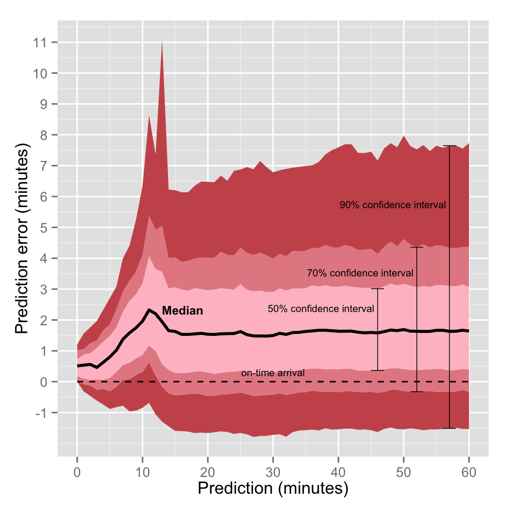
Then I calculated the quantiles of actual arrival times (df$est) for each possible prediction (0, 1, 2, 3…100 minutes) using .05 increments for flexibilibity.
estq <- data.frame(as.matrix(aggregate(
		est~Minutes, df, function(x) quantile(x, seq(0,1,.05)))
	))
which turns out to be this (only showing predictions 0-5 minutes):
  Minutes    est.0.    est.5.  est.10.  est.15.   est.20.   est.25.  est.30.  est.35.  est.40.  est.45.  est.50.  est.55.   est.60.   est.65.   est.70.   est.75.   est.80.  est.85.  est.90.  est.95.  est.100.
       0 0.0000000 0.0000000 0.000000 0.000000 0.1702833 0.1708667 0.171920 0.340590 0.341700 0.343200 0.510850 0.512670 0.5157933 0.6817667 0.6845333 0.7331833 0.8552367 1.021637 1.031120 1.203293  2.252650
       1 0.1713333 0.6837833 0.853850 0.912685 1.0263000 1.1005667 1.197133 1.229026 1.366980 1.373926 1.536183 1.541720 1.7034033 1.7104717 1.7542533 1.8816333 2.0454300 2.058844 2.228947 2.560958  3.624817
       2 0.8558500 1.5370892 1.710678 1.880133 2.0340733 2.0560000 2.219588 2.228256 2.389870 2.398855 2.559617 2.568933 2.7259833 2.7410317 2.9015967 2.9216333 3.0806933 3.248529 3.423398 3.760646  5.174917
       3 1.3672333 2.3879967 2.568347 2.738833 2.9066067 3.0677500 3.087460 3.246477 3.271973 3.419170 3.461833 3.593877 3.6993467 3.7717700 3.9336867 4.0939833 4.1599733 4.334380 4.616890 4.962980  6.411083
       4 1.9013167 3.2562533 3.588217 3.762400 3.9303300 4.0656333 4.145327 4.281953 4.443430 4.511590 4.628600 4.785950 4.8661900 4.9807400 5.1377533 5.3032667 5.4775833 5.666597 5.984240 6.335517 15.470133
       5 2.5674667 4.1172400 4.453617 4.688427 4.9506233 5.1217750 5.205957 5.337202 5.481750 5.643520 5.803400 5.849483 5.9972100 6.1619100 6.3218600 6.4860917 6.6677600 6.863565 7.217443 7.708432 16.494933
So when the Next Bus app predicts 5 minutes:
50% of the time the bus arrives between 5.1 and 6.5 minutes.
70% of the time the bus arrives between 4.7 and 6.9 minutes.
90% of the time the bus arrives between 4.1 and 7.7 minutes.
We can visualize this using the code below to explore the confidence intervals for each possible prediction: 0,1,2,3…60 minutes. I cut it off at 60 minutes because the data gets sparse after that and the lines generally continue to flat line.
require('ggplot2')
estq60 <- estq[estq$Minutes<=60,] # keeping just predictions 0-60
colfunc <- colorRampPalette(c("pink", "firebrick"))
cols <- colfunc(4)

plt <- ggplot(estq60, aes(x= Minutes))
plt1 <- plt +
  geom_ribbon(aes(ymin=est.5.-Minutes,  ymax=est.15.-Minutes), fill=cols[3]) +
  geom_ribbon(aes(ymin=est.15.-Minutes,  ymax=est.25.-Minutes), fill=cols[2]) +
  geom_ribbon(aes(ymin=est.25.-Minutes,  ymax=est.50.-Minutes), fill=cols[1]) +
  geom_ribbon(aes(ymin=est.50.-Minutes,  ymax=est.75.-Minutes), fill=cols[1]) +
  geom_ribbon(aes(ymin=est.75.-Minutes,  ymax=est.85.-Minutes), fill=cols[2]) +
  geom_ribbon(aes(ymin=est.85.-Minutes,  ymax=est.95.-Minutes), fill=cols[3]) +
  geom_line(aes(y=est.50.-Minutes), col = "black", lwd = 1) +
  geom_line(aes(y=0), col = "black", lwd=0.5, linetype='dashed') +
  xlab("Prediction (minutes)") + ylab("Prediction error (minutes)") +
  scale_y_continuous(breaks=seq(floor(min(estq60$est.10.-estq60$Minutes)), ceiling(max(estq60$est.95.-estq60$Minutes)), 1)) +
  scale_x_continuous(breaks=seq(0, 60, 10)) +
  geom_errorbar(data=estq[58,], aes(ymin=est.5.-Minutes, ymax=est.95.-Minutes), width=2, lwd=0.25) +
  geom_errorbar(data=estq[53,], aes(ymin=est.15.-Minutes, ymax=est.85.-Minutes), width=2, lwd=0.25) +
  geom_errorbar(data=estq[47,], aes(ymin=est.25.-Minutes, ymax=est.75.-Minutes), width=2, lwd=0.25) +
  annotate("text", label="50% confidence interval", x=47-1.5, y=estq60$est.65.[47]-estq60$Minutes[47], size=2.5, hjust=1) +
  annotate("text", label="70% confidence interval", x=53-1.5, y=estq60$est.80.[53]-estq60$Minutes[53], size=2.5, hjust=1) +
  annotate("text", label="90% confidence interval", x=58-1.5, y=estq60$est.90.[58]-estq60$Minutes[58], size=2.5, hjust=1) +
  annotate("text", label="Median", x=12+1, y=estq60$est.50.[12]-estq60$Minutes[12], size=3, hjust=0, fontface="bold")

plot(plt1) #visualize plot before saving
ggsave(filename="/png/ggconf.png", plot=plt1, width=5, height=5, dpi=200) 
First note from the red waves above that predictions are consistently biased conservatively. That is, buses usually (~80% of the time) arrive after their predicted time.
Second note that the something weird aboout predictions of 11,12 and 13 minutes. As one would expect, the error of predictions is less when the bus is closer (<10 minutes away). As the bus gets closer, Next Bus only has to predict a couple periods ahead rather than many. It’s well known among forecasters (and non-forecasters) that the general happenings of tomorrow is a much easier task than predicting the general happenings for a specific day decades in the future. We have more information about tomorrow.
So why are predictions made a few months (11-13 minutes) into the future worse than those made years into the future (14-60 minutes)? My first thought was that forecasts are recalibrated when they start predicting in the 11-13 minute window.
I used to forecast macroeconomic indicators for a small emerging market country when I worked at the Fed. GDP, CPI inflation, monetary policy, all that good stuff. If there’s one thing I learned from my role as a country analyst, it was that forecasting is hard and usually more art than science… at least for macro indicators. Forecasts more than a couple years out are based on, well, usually not much. However macroeconomic forecasts for the next quarter or two are more grounded. There is higher frequency and more recent (useful) data to make forecasts based on nowcasts, timeseries models, and knowledge of policy, momentum, etc.
So when presented with new information about the economy of my forecast country during the forecast period (every month or two), I often faced a choice: revise or the stay the course. Knowing when to revise is hard. One doesn’t want to overreact to information too soon just to revise a forecast in the opposite direction next time. Consumers of forecasts value both accuracy AND consistency. The balance of which is tricky – there is usually a tradeoff.
This revision behavior explains why the Next Bus errors trend downward as predictions decrease from 10 to 0 minutes. But why the spike in errors 11-13 minutes out? My second thought led me to create the visualization below which allows for an investigation of individual buses and their predictions throughout the week. Possibly a forecast bug? An idiosyncrasy of this particular bus route?
Surprisingly, the revision hypothesis appears to be dead wrong (or at least very poorly implemented). Predictions often follow a consistent trend (straight diagonal line) until some point where predictions prematurely jump to 11, 12, or 13 minutes, when in reality, there is much longer to wait.
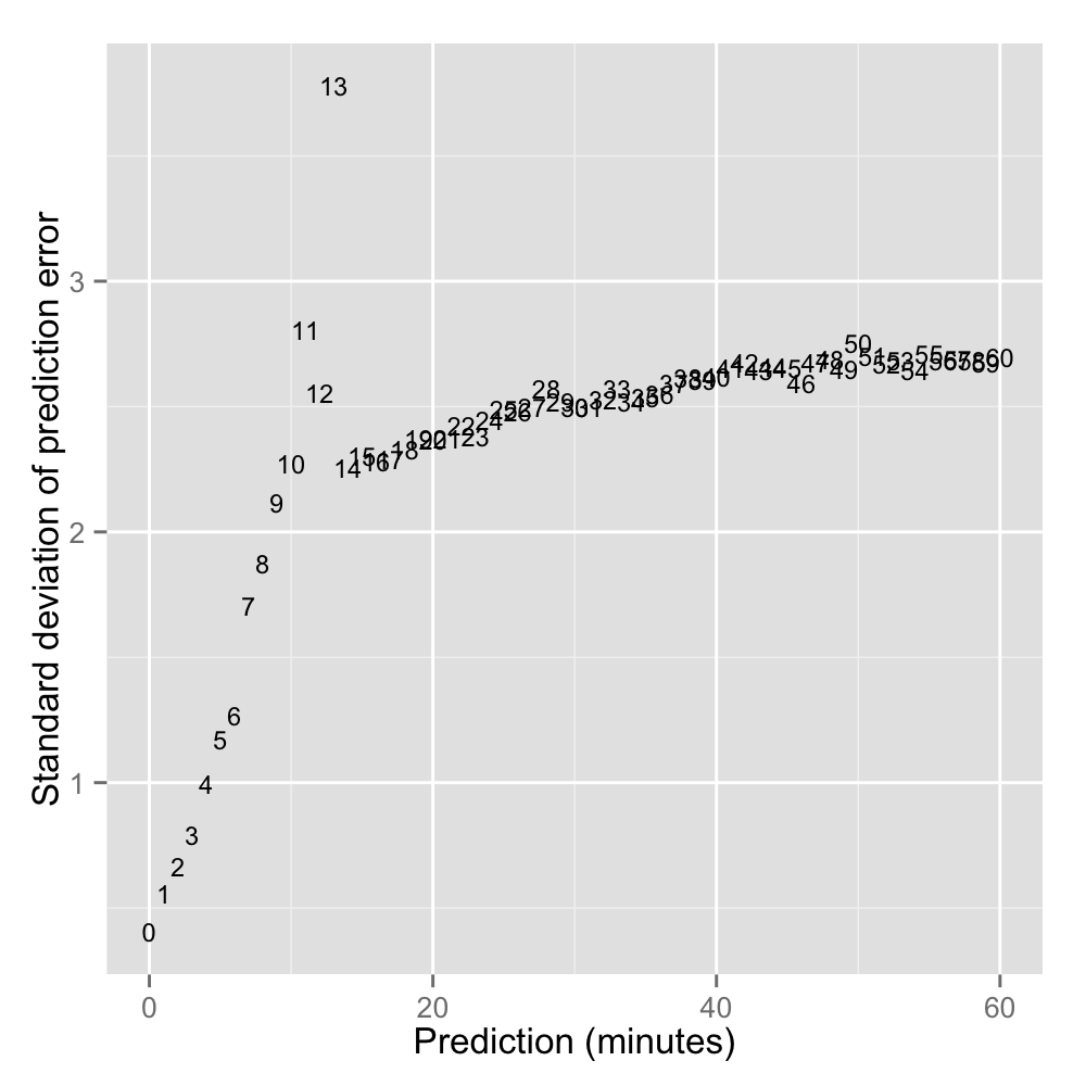
Below: Exploring the variation around predictions 0, 1, 2, 3 … 60 minutes. Reaffirming that predictions of 11-13 minutes are the most volatile.
estvar <- data.frame(as.matrix(aggregate(err~Minutes, df, function(x) sqrt(var(x)))))

plt2 <- ggplot(data=estvar[estvar$Minutes<=60,], aes(x=Minutes,y=err, label=Minutes)) +
          geom_text(aes(Minutes,err), size=3) +
          ylab("Standard deviation of prediction error") +
          xlab("Prediction (minutes)")

ggsave(filename="/png/ggstddev.png", plot=plt2, width=5, height=5, dpi=200) 
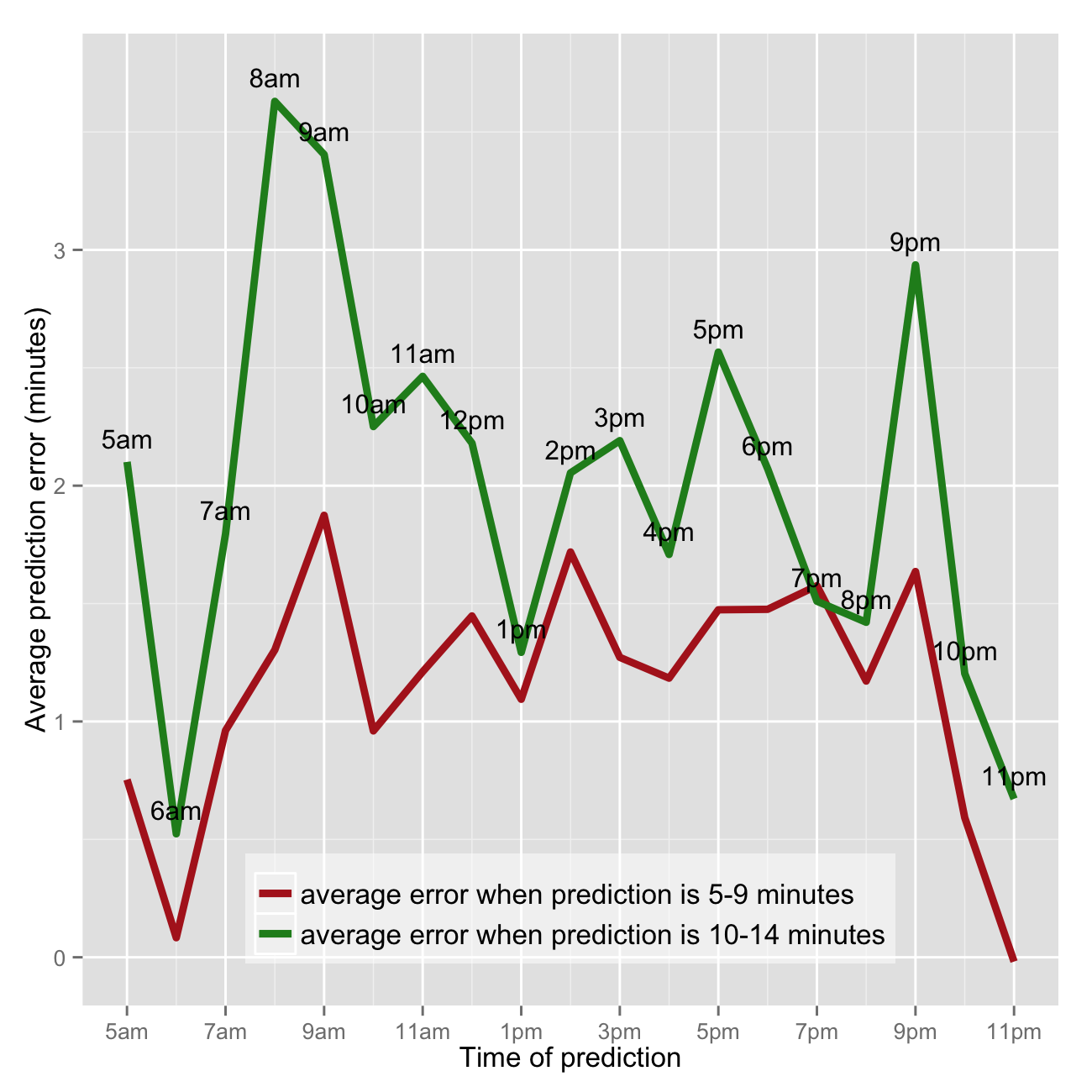
Are Next Bus predictions less reliable during certain parts of the day, like rush hour? Short answer, yes - predictions are off the mark (late) most in the morning between 8am and 10am. Note this analysis is for the 64 bus heading from a residential neighborhood (Petworth) south to Federal Triangle (downtown DC). So peak ridership and traffic and thus prediction errors along the bus route would likely be in the morning.
I’m particularly interested in assessing relative accuracy of rush hour predictions, so I’m only looking at predictions on the weekdays. The lubridate R package makes working with POSIXct dates easy. First creating dummies for weekday and extracting hour.
require('lubridate')
df$day <- weekdays(df$time)
df$weekday <- ifelse(df$day %in% c('Monday', 'Tuesday', 'Wednesday', 'Thursday', 'Friday'), 1, 0)
df$hour <- hour(df$time)
Calculating the median prediction error for each prediction increment (1,2,3 … 60 minutes) by hour of day the prediction was made.
agg <- with(df[df$weekday==1,], aggregate(err, by=list(hour, Minutes), median))
names(agg) <- c('hour', 'Minutes', 'err')
which returns something like this (sample below). So the average error for predictions made between 20:00 (8pm) 21:00 (9pm) when Next Bus predicts 3 minutes is 0.59874 minutes or 36 seconds (late).
#print(agg)
hour     Minutes    err
20       3          0.59874167
21       3          0.26386667
22       3         -0.04255000
23       3         -0.25696667
 0       4          1.82138333
 5       4          0.62696667
 6       4         -0.06708333
 7       4          0.80045000
 8       4          0.96903333
 9       4          0.80225000
To make this easier to interpret and analyze, I want to reshape the results from long to wide format.
agg2 <- reshape(agg[agg$Minutes<=60,], timevar='Minutes', idvar='hour', direction='wide')
agg2 <- agg2[agg2$hour>=5,]
which creates something like this (sample):
#print(agg2)
hour     err.0     err.1      err.2      err.3       err.4     err.5     err.6     err.7      err.8
    5 0.5116583 0.5411750 0.73470833  0.7683667  0.62696667 0.3133833 0.5913083 0.8793417 1.04840000
    6 0.3423917 0.1991000 0.05491667 -0.0438500 -0.06708333 0.1321667 0.1897833 0.3459500 0.07853334
    7 0.5158500 0.8785333 0.91016666  1.0939833  0.80045000 0.9994833 0.8455833 0.9087167 0.77608333
    8 0.5109667 0.7079833 0.90148333  1.1051333  0.96903333 1.1482167 1.1714500 1.0322583 1.39443333
    9 0.5126917 0.7099667 0.91218333  0.5982667  0.80225000 0.9846500 1.2013000 1.8911333 2.78528333
   10 0.3447833 0.3663167 0.43183333  0.3377000  0.50693334 0.5863583 0.8441750 0.7526417 1.30873333
Now creating the graphic that puts it all together. I chose to not show average errors when predictions are 1,2,3 … 60 minutes separately. Firstly because the trend is the same and secondly because it’s messy. So I averaged together the median errors for predictions of 5,6,7,8,9 minutes in one goup and 10,11,12,13,14 minutes in a separate group.
require('ggplot2')

cols <- c('firebrick', 'forestgreen')
agg2$err.5.9 <- rowMeans(agg2[,paste('err.', 5:9, sep='')])
agg2$err.10.14 <- rowMeans(agg2[,paste('err.', 10:14, sep='')])

plt3 <- ggplot(agg2, aes(x=hour)) +
  geom_line(aes(y=err.5.9, color=cols[1]), lwd=1.5) +
  geom_line(aes(y=err.10.14, color=cols[2]), lwd=1.5) +
  geom_text(aes(y=err.10.14+.1, label=military2std(hour)), size=4) +
  scale_x_continuous(breaks=seq(min(agg2$hour), max(agg2$hour), 2), labels=military2std(seq(min(agg2$hour), max(agg2$hour), 2))) +
  ylab('Average prediction error (minutes)') + xlab('Time of prediction') +
  scale_colour_manual(values=cols[1:2], labels=c('average error when prediction is 5-9 minutes','average error when prediction is 10-14 minutes')) +
  theme(legend.title=element_blank()) +
  theme(legend.position=c(.5,.1)) +
  theme(legend.text=element_text(size=12)) +
  theme(legend.background = element_rect(fill=alpha('white', 0.5)))

ggsave(filename="png/gghourmedian.png", plot=plt3, width=5, height=5, dpi=200, scale=1.3) 
So predictions are wrong (late) the most between 8am and 10am on the weekdays. The errors jump around a bit throughout the day. Some of this could be the chosen frequency (hours)… it would likely be smoother if I chose 4 or 5 periods of the day spanning several hours each. Some of this could be the fact that I’m only analyzing one week of data for one bus line. Perhaps there was anomalous behavior around predictions made at 9pm for a couple buses that is driving the spike in prediction errors between 9pm and 10pm.
Analysis for next time!
